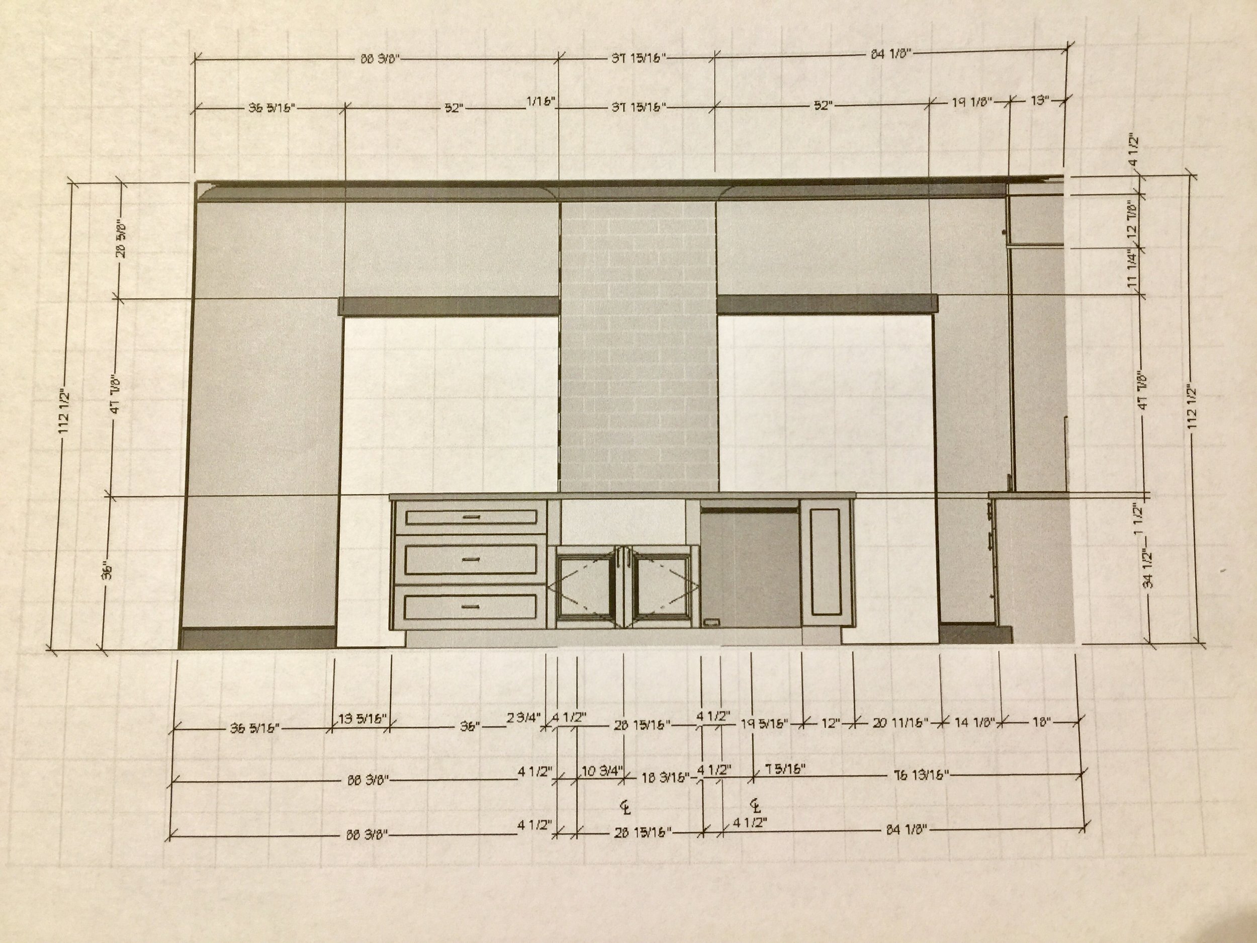
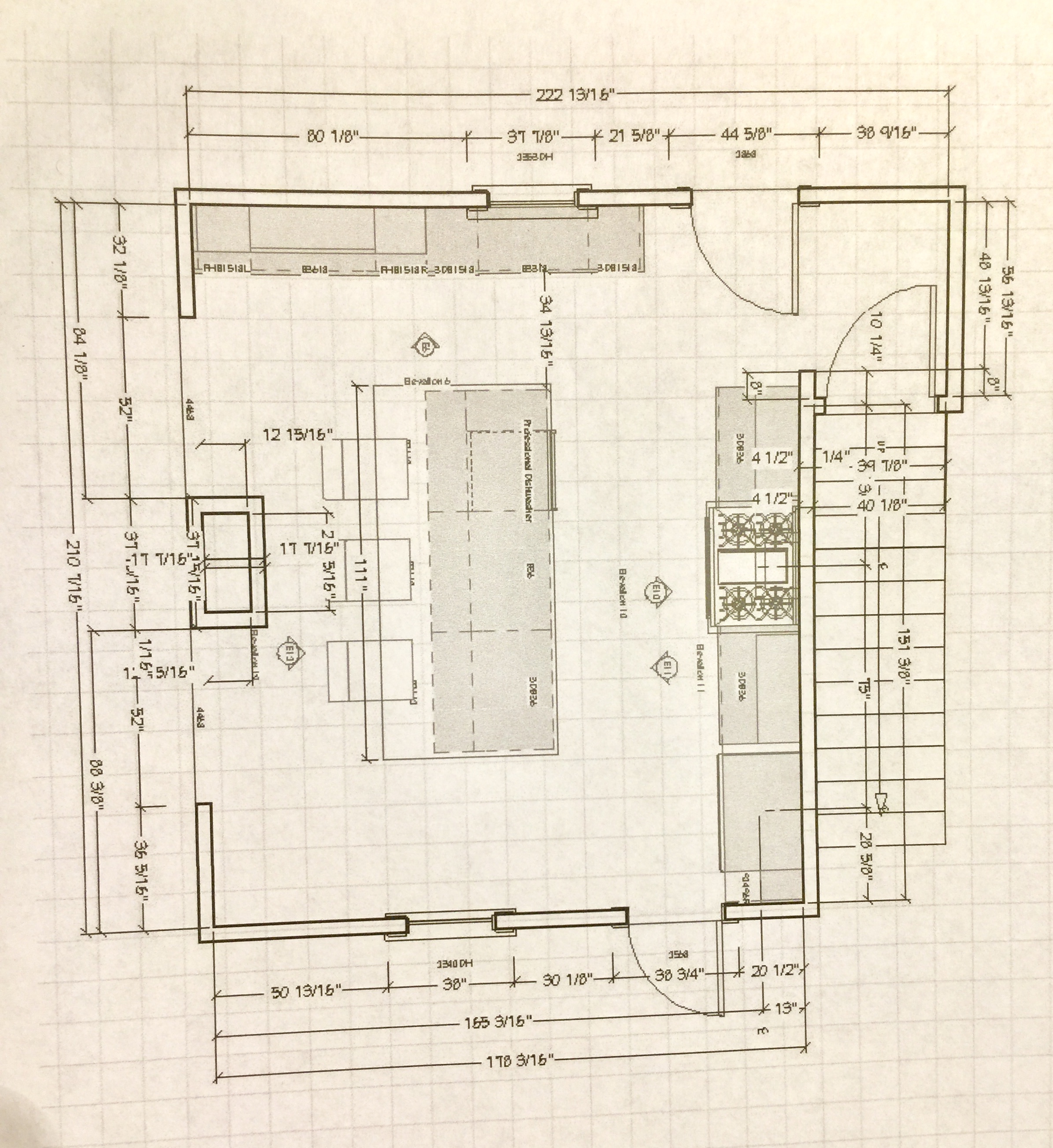
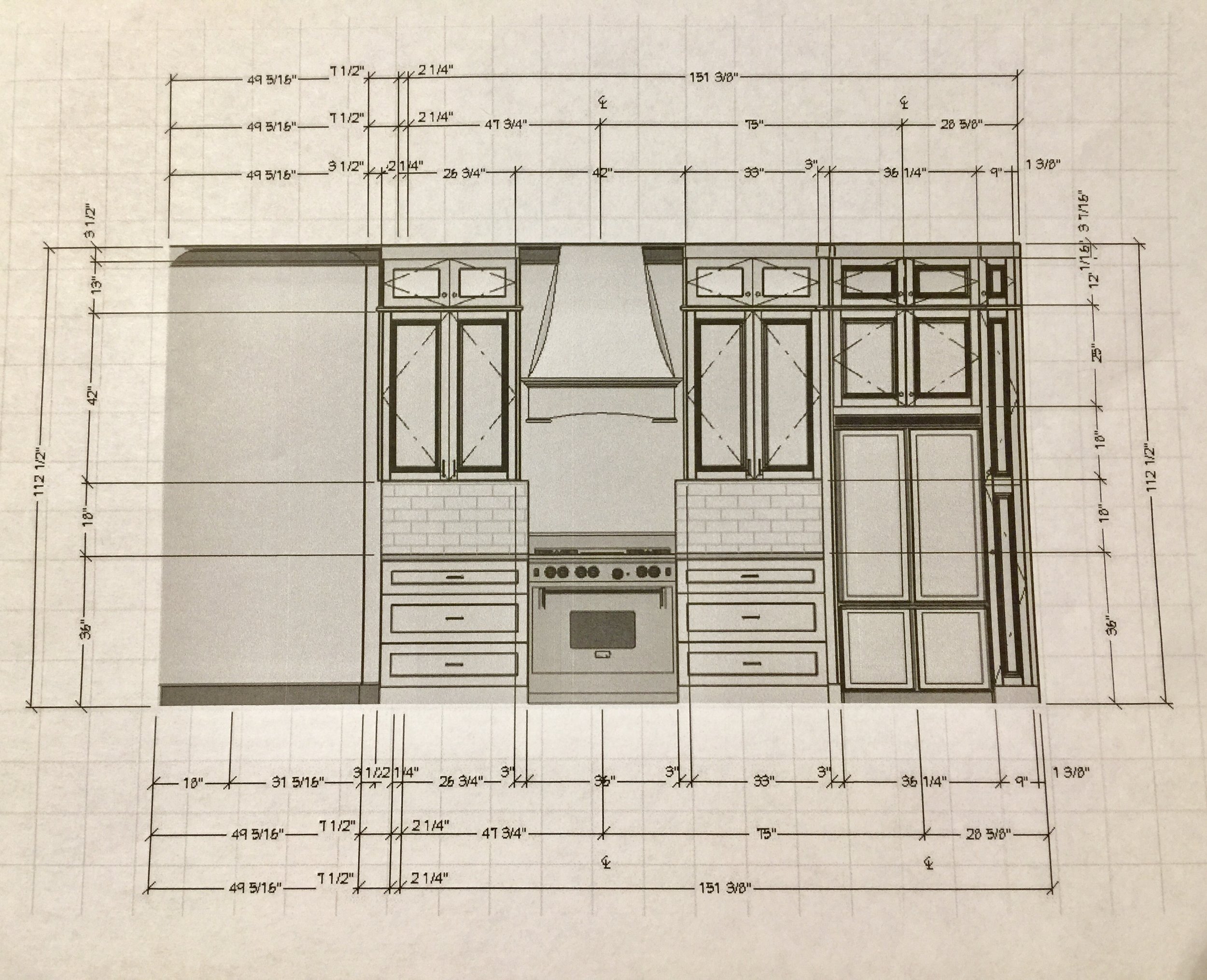
We Have an Official Kitchen Design!
Designing a kitchen is really hard. Lots of blood, sweat, tears, and fighting about where the microwave should go.
It looks like fun on TV but it is kind of a pain in the ass in real life. You may have heard about the infamous "Kitchen Triangle" theory that designers use to create a functional and aesthetically pleasing kitchen based on the position of the stove, sink, and refrigerator. Unfortunately, the triangle is true. Functionality is more important than pretty when it comes to kitchens. Don't tell anyone I typed that. I always pick pretty over functional and that is why Gary has his work cut out for him.
And per usual, he is right. There is nothing more disappointing than falling in love with a potential house and then getting to the kitchen and seeing a hot mess of badly placed appliances and ugly cabinets. We've looked at an unusually large number of homes over the years and I've seen everything from ovens that can't open all the way to refrigerators in front of windows.
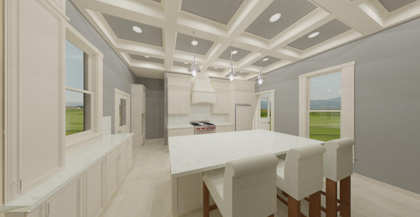
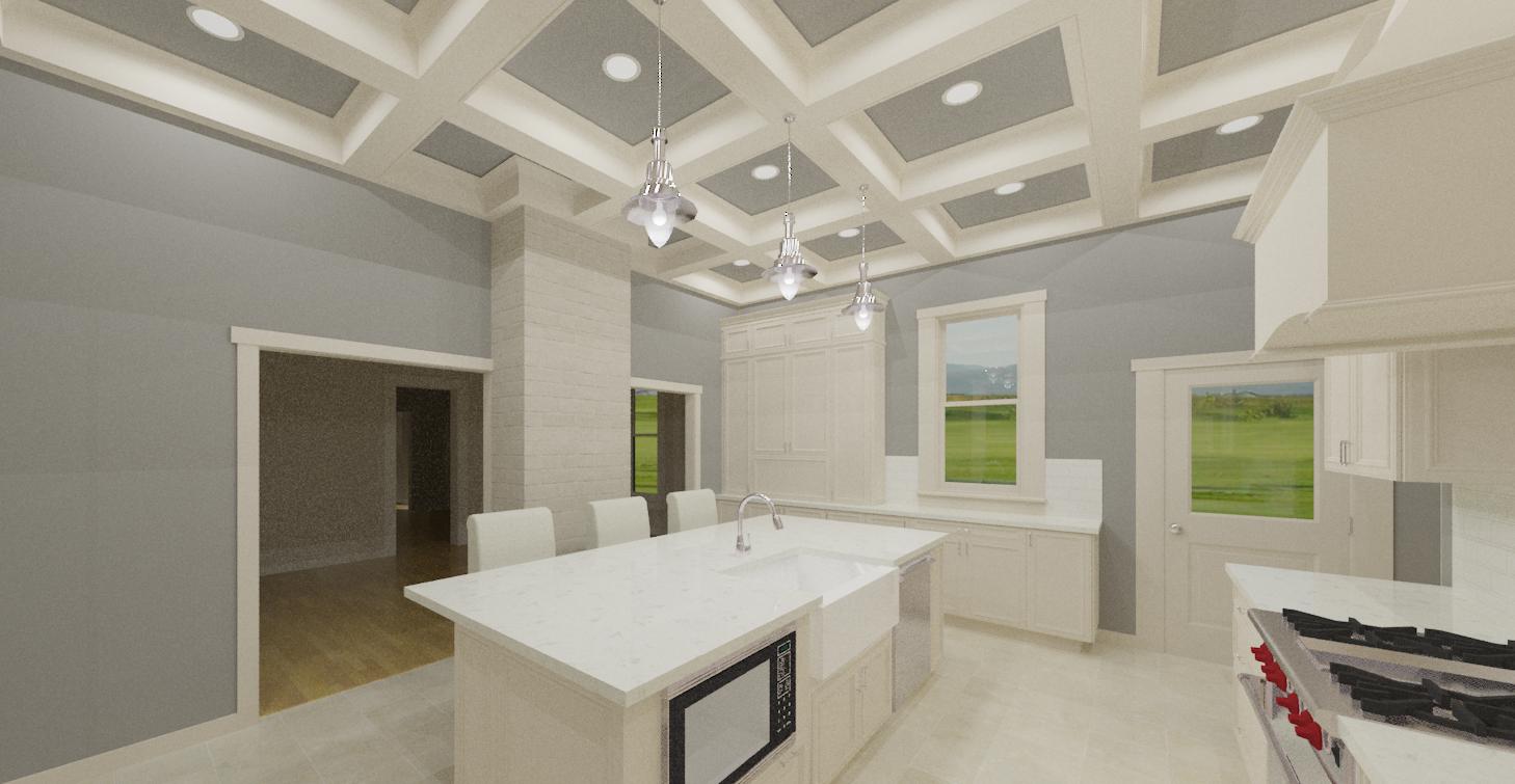
Which brings us to our kitchen... The space is pretty large by normal kitchen standards but we lose quite a bit of space because how the kitchen is situated. When our home was built in 1883 people didn't use kitchens for entertaining. Ours is at the back of the house and has two doors, two entryways, butler stairs and two windows in an 18' by 15' space. Which means you've died and gone to design hell because there is only one wall to fit cabinets and a range on. No place for a pantry. No wall for tall pantry cabinets. We didn't want to get rid of the windows because one window faces outside (our only natural light source in the space) and the other window looks out into the attached sunroom. If we got rid of a window or a door, it would turn the space into a black hole of kitchen sadness. We basically started out with the worst possible layout for a functional kitchen. Too many points of entry and not enough walls.
This is how people die in horror movies
This is when Gary being a fabulous kitchen designer comes in handy. He really understands how people use kitchens and where appliances need to be placed. I forgot we even needed a dishwasher because I haven't had one for 8 months. A big island was important to us because we wanted to keep the attached formal dining room on the formal side and have another option for entertaining and fast meals.
I hate open floor plans with a passion but I also understand that sometimes a formal dining room is not the right setting. Our dining room (we will get to that later) is massive and our table seats 14 people. Which is overkill for quiet dinners and a little stuffy for having pizza with friends. Plus, Gary really likes it when people watch him cook so having people in our kitchen isn't problematic. Just don't offer to help. There was an actual line in the flooring at our last house that I wasn't allowed to cross while he was cooking. You poison two people and catch one house on fire and suddenly you are banned from entering the kitchen... Both people survived.
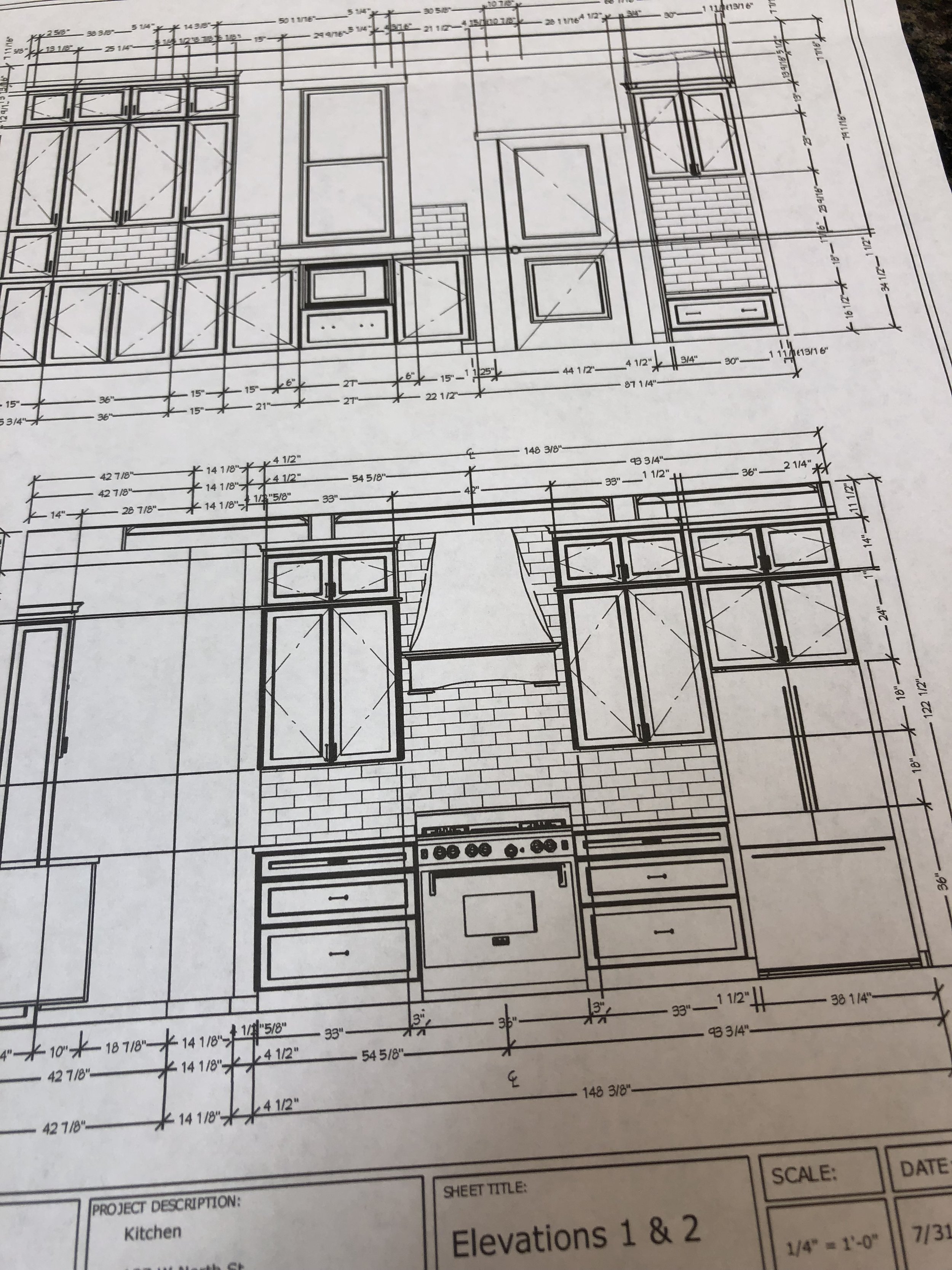
Anyhoo... Gary came up with this fantastic plan to have the refrigerator inset into the wall just a bit so you can still get out the side door to the sunroom on the right. The sink had to go in the island (which I also HATE) because the cabinets on the other wall were not deep enough for a sink. I really wanted the sink in front of the exterior window so I could spy on the neighbors while I do dishes but it just wasn't functional. So I spent 8 minutes having a hissy fit and then realized it was actually fine because now I can watch TV while I do the dishes which makes me happy.
We are doing a row of cabinets that will run below the kitchen window and end with a built-in style hutch. This is a great place to store pots and pans and food and crap that you don't want out on the countertops since we don't have room for an actual pantry. I love the look of anything built-in. It was really important to me that the kitchen cabinets look like furniture and not like cabinets. This is why we decided on a variety of cabinet depths and lengths to emphasis the ceiling height and charachter of the home.
And we still get to have a big enough island to host a dance contest on. Yes, we throw that kind of party. So bring your lampshade and some skid-proof socks!
Click below for the full gallery and comps of the kitchen. Finishes and light fixture options coming soon! Assuming we can still afford them after we get the bill for all those can lights.
