Our not-so-white White Kitchen Finds a Backsplash!
It’s coming together!
Sometimes designs go exactly as you had pictured them and sometimes... they go to shit.
We had originally picked very white countertops with almost no pattern. Very minimal. The idea was to go clean and classic since countertops cost a fortune and we are never moving so we will be stuck with whatever we pick for all eternity. I plan on dying here and then haunting Gaye Gardens (and being planted in the yard) but that’s a story for another time.
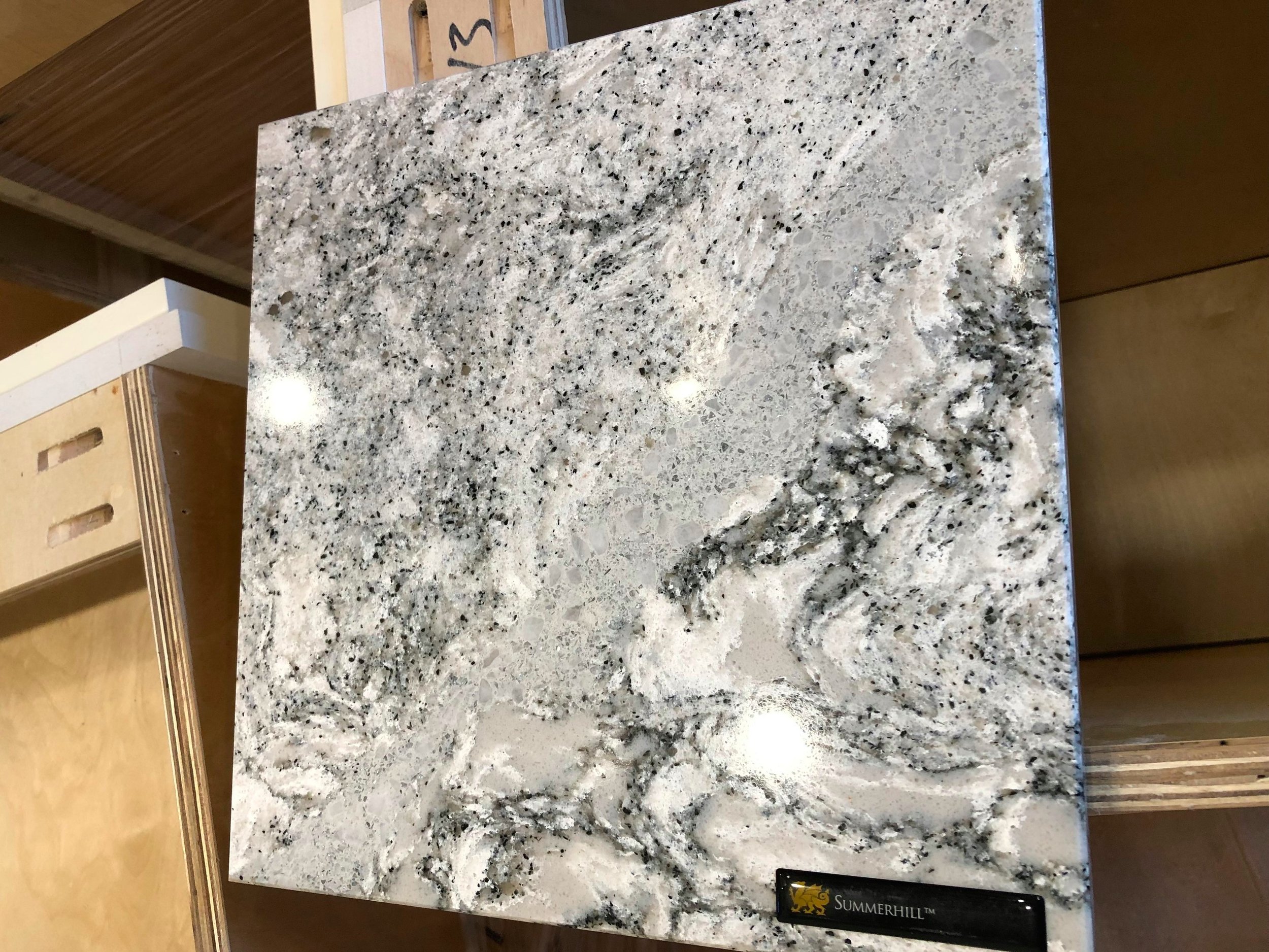
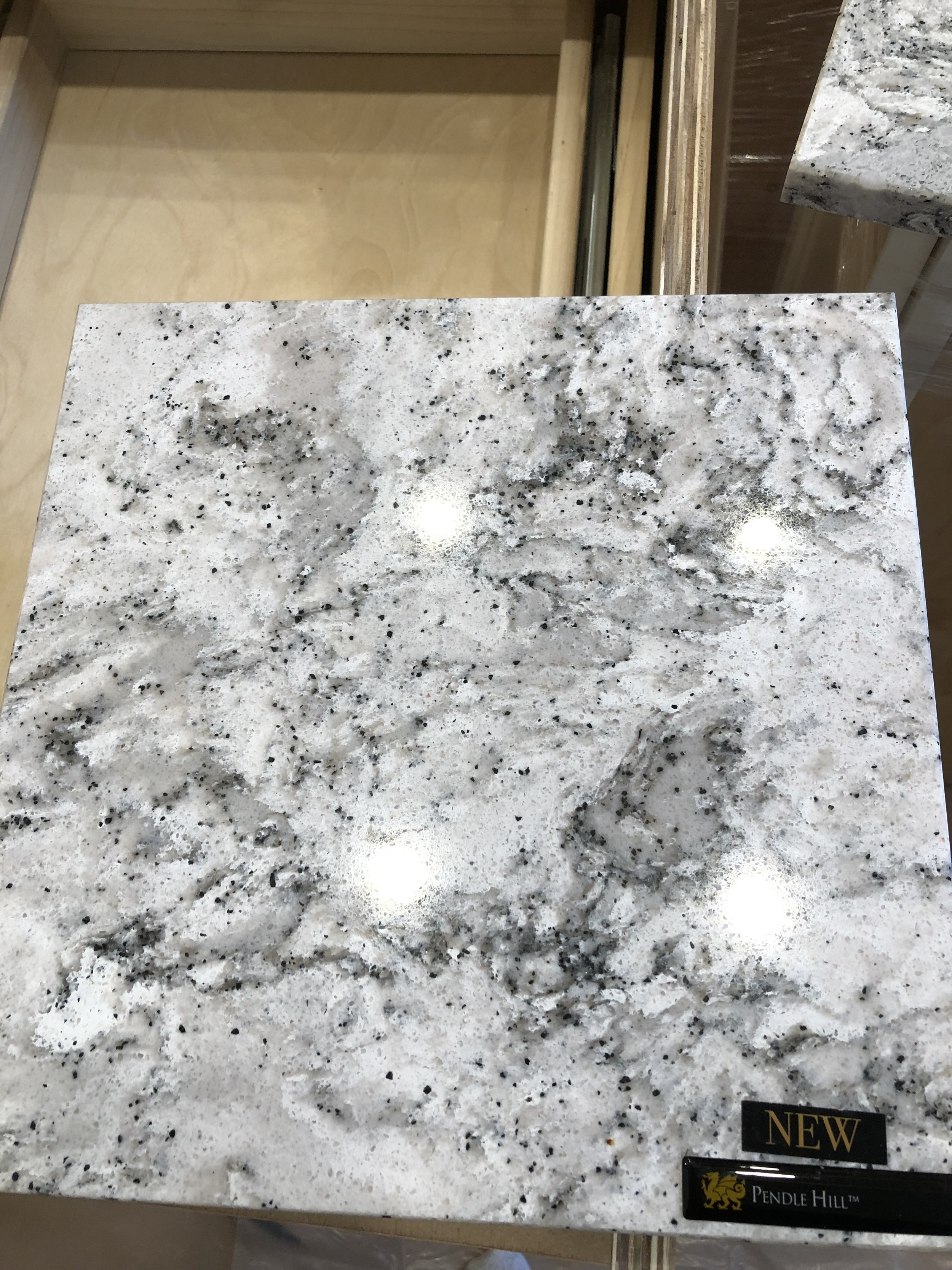
Anyway, all white everything sounds really good in theory but the white was just SO boring. We needed some bling. We decided to switch back the countertops to our first love--Cambria Summerhill. I made a previous post about loving it but that it kind of looked like an anthill or a beach so we weren’t sold on it. Lucky for us, they now make a plain version (less glitter streaks = no anthill) that will look beautiful on the giant island and we can keep the glitter streaks on the perimeter. So the island will be Pendle Hill and everything else will be Summerhill. Hooray for making a decision! The countertops were supposed to arrive today but due to some unfortunateness with the countertop people, they are coming Monday.
And our original plan of white subway tile didn't exactly work out either. We love subway tile and I thought it would be really clean and classic and never go out of style and blah blah blah all the stuff that every other blog tells you about subway tile. We put the countertop sample in the kitchen with the plain white subway tile and it looked like PLAIN WHITE SUBWAY tile. It was completely underwhelming.
BORING!
A few hundred samples later, we fell in love with this beautiful Venatino marble subway tile. It has a matching chair rail and I think it is going to be beautiful.
Ohhhhhh! Pretty!
But we also wanted something really special behind the stove since the fancy schmancy stove is our big splurge. We don’t want it to be too muted. We found quite a few samples that we liked in theory that look terrible in the space.
Don’t ask.
Viva Las Vegas!
They just don't work.
There's this really ridiculously beautiful plaid tile that AKDO makes (Balmoral Plaid to be exact) that we've been in love with for years but it is on the expensive end of our budget (AKA we can't afford it) but we are going to look at it tomorrow because I think that we may be able to afford it if we do a smaller patch of it instead of taking it all the way to the ceiling and then we can just frame it out and make it more of a feature. Or I can sell an organ or part of the china collection. Then the kitchen still looks classic and era-appropriate(ish) because LOOK at how beautiful this tile is!!! It’s like little angels came down and handmade it. It is Gone With the Wind Fabulous!
Imagine looking at this beautiful tile while you cook:
So tomorrow, poor Gary is driving me to Minneapolis so I can look at the Balmoral Plaid. I'm not sure what the moral of this story was but I'm starting to think that this house has a way of making its own decisions. Everything is falling just into place and I'm in love with our dream kitchen. I mean Gary’s dream kitchen. Fingers crossed we love that plaid tomorrow because the countertops are going in Monday!


